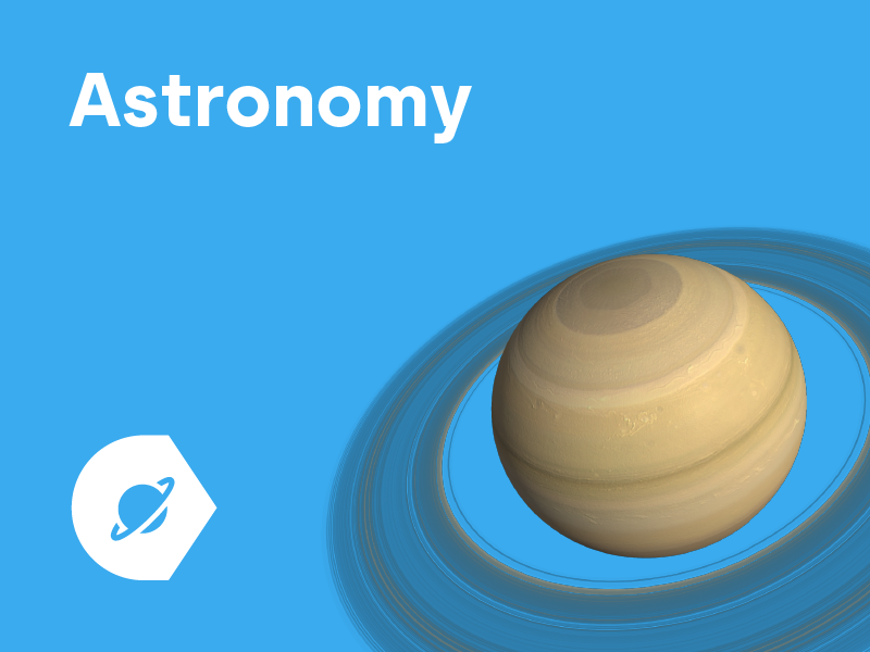
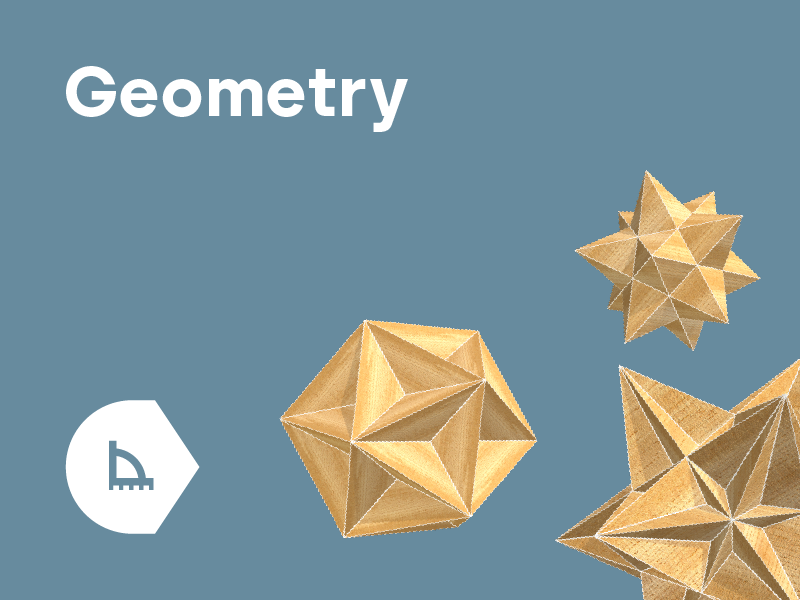
Card construction
The design of all cards and subsequent grids is based on a uniform 4:3 aspect ratio, which we divide into a 12:9 ratio for grid and alignment purposes.

The design of all cards and subsequent grids is based on a uniform 4:3 aspect ratio, which we divide into a 12:9 ratio for grid and alignment purposes.
Align the text from top left. The margin is always the size of one grid piece. The icon is two grid ticks in size.


The image is always positioned on the bottom right and extends beyond the layout canvas on at least one side. The final placement of the image depends on the shape of its silhouette, so we treat each card individually.
Image core - the key centre of gravity of the image
Mid - occasional image overlaps
Low - exceptional image overlaps


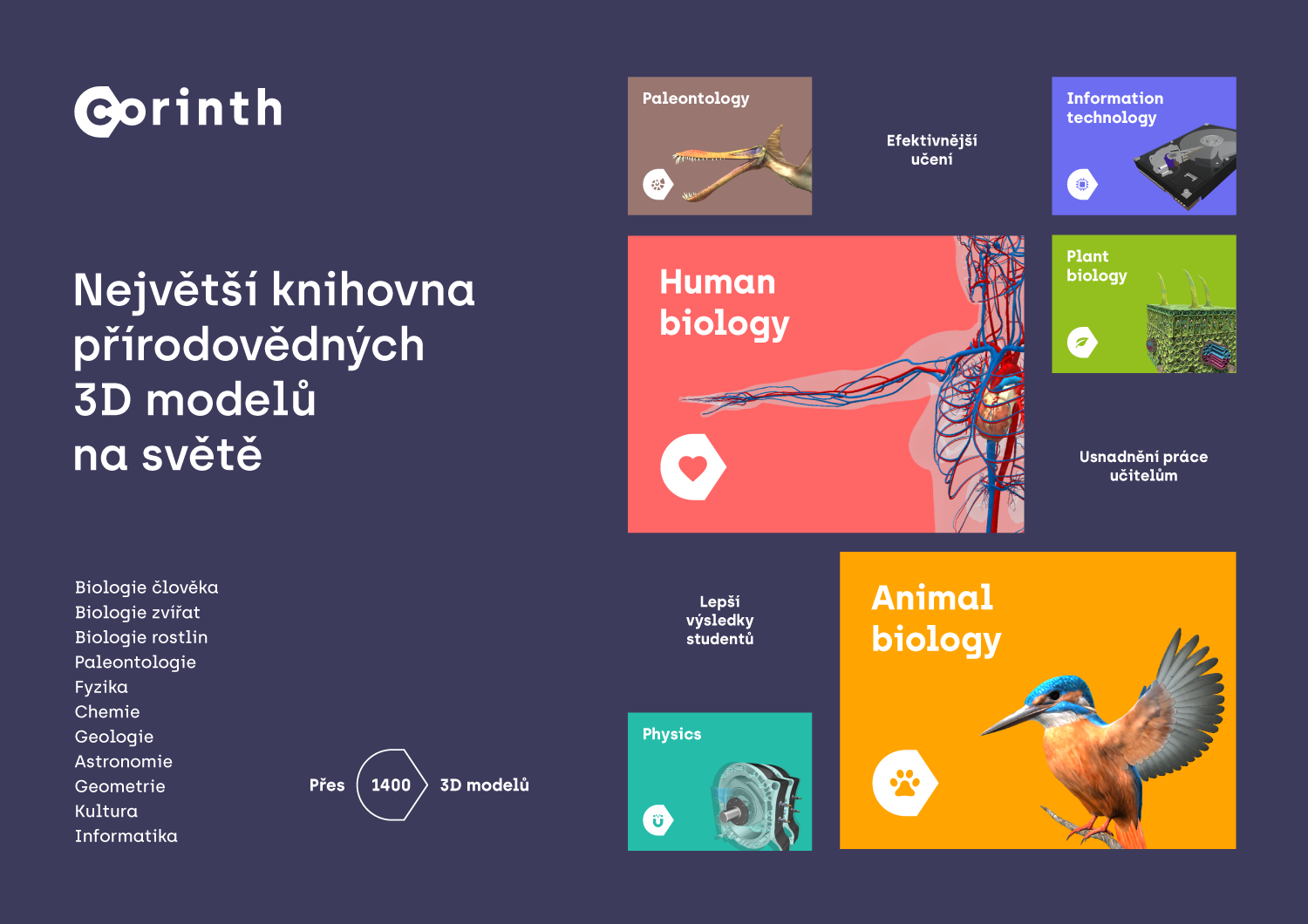
The layout of the printouts consists of two or three columns of tiles. Each tile has an aspect ratio of 4:3. A large tile occupies the space of four small tiles.


About half of the tiles are filled with short text (attributes or benefits) and half with individual cards.
The back of the print contains two columns of tiles and photographs are inserted instead of cards.